Today we will tell you a little more about the second purpose of our 2020 wish-list: dive in the sea at dusk.
This is the year of blue, our favourite color.
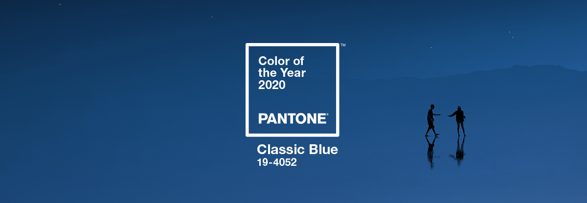
Pantone announced that its 2020 Color of the Year is Classic Blue, a shade reminiscent of the sky at dusk.
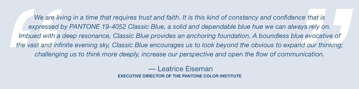
"It's a color that anticipates what's going to happen next," said Laurie Pressman, the vice president of the Pantone Color Institute, which selects the Color of the Year. "What's the future going to bring as we move into the evening hours?"
PANTONE CLASSIC BLUE
Instilling calm, confidence, and connection, this enduring blue hue highlights our desire for a dependable and stable foundation on which to build as we cross the threshold into a new era.
A timeless and enduring blue hue, PANTONE Classic Blue is elegant in its simplicity. Suggestive of the sky at dusk, the reassuring qualities of the thought-provoking PANTONE Classic Blue highlight our desire for a dependable and stable foundation on which to build as we cross the threshold into a new era.
Imprinted in our psyches as a restful color, PANTONE Classic Blue brings a sense of peace and tranquillity to the human spirit, offering refuge. Aiding concentration and bringing laser like clarity, PANTONE Classic Blue re-centers our thoughts. A reflective blue tone, Classic Blue fosters resilience.
Non-aggressive and easily relatable, the trusted PANTONE Classic Blue lends itself to relaxed interaction. Associated with the return of another day, this universal favorite is comfortably embraced.
“When we look at the world around us, we know that we’re living with a lot of unrest, where some days we don’t feel quite as secure” Leatrice Eiseman, the executive director of the company’s Color Institute explains. “Blue, from an emotional, psychological standpoint, has always represented a certain amount of calm and dependability. It’s a color that you can rely on.”
It’s also a color that’s ubiquitous the world over. During the company’s global research effort (one that begins well over a year in advance of the announcement), Classic Blue popped up in fields as diverse as the art market, the beauty industry, automotive manufacturing, tech, and even outer space.
The company partnered with several brands to develop the smell, sound, taste, and texture of Classic Blue.
This means that a simple shade of color encloses an entire world within itself.
Classic Blue therefore has a fabric, a tea wellness oriented, a candle with a fragrant contemplation of where sky and sea meet and its own soundtrack: a nostalgic song that takes us to a place of comfort and familiarity.
The Classic Blue audio track titled "Vivid Nostalgia": https://youtu.be/TSCN_-gIbVg
For sure this acknowledges that colour has the power to impact a lot on our lives and it is a way to express and affect ideas and emotions.
PANTONE's Classic Blue is pitched somewhere in-between these mid-sea blues and the falling ink of a dusky sky.
COLOR PSYCHOLOGY
Color psychology is the study of hues as a determinant of human behaviour. Color is an integral element of our world, not just in the natural environment but also in the man-made architectural environment. Color always played a role in the human evolutionary process. The environment and its colors are perceived, and the brain processes and judges what it perceives on an objective and subjective basis. Psychological influence, communication, information, and effects on the psyche are aspects of our perceptual judgment processes. Color can influence a person; however, it is important to remember that these effects differ between people. Factors such as gender, age, and culture can influence how an individual perceives color.
Color psychology is also widely used in marketing and branding. Many marketers see color as an important part of marketing because color can be used to influence consumers' emotions and perceptions of goods and services. Companies also use color when deciding on brand logos. Colors are also important for window displays in stores.
In addition, in the field of architecture and design, the choice and use of colour plays a very important role, with the goals of color design that are not relegated to decoration alone.
The perception of color in architecture
Especially in the last eleven decades, empirical observations and scientific studies have proven that human-environment-reaction in the architectural environment is to a large percentage based on the sensory perception of color. These studies include the disciplines of psychology, architectural psychology, color psychology, neuropsychology, visual ergonomics, psychosomatics, and so forth. In short, it confirms that human response to color is total it influences us psychologically and physiologically.
Color is a sensory perception, and as any sensory perception, it has effects that are symbolic, associative, synesthetic, and emotional. This self-evident logic has been proven by scientific investigation. These being design goal considerations that demand adherence to protect human psychological and physiological well-being within their man-made environment. The color specifier/designer has the task of knowing how the reception of visual stimulation, its processing and evoked responses in conjunction with the hormonal system, produces the best possibilities for the welfare of human beings. This is of utmost importance in varied environments, such as medical and psychiatric facilities, offices, industrial and production plants, educational facilities, homes for the elderly, correctional facilities, and so forth. Each within themselves having different task and function areas.
The architect must consider the color effect of every element of a building’s construction, from the earthy colors of primary construction materials like wood, stone, brick, and marble, to the expansive variety of colors available for paint, doors, windows, siding, and trim.
In color psychology, therefore, it should be considered: biological reaction to a color stimulus, subconsciousness, conscious symbolism association, cultural influence, trends/style, and fashion influence and personal relations.
Some curiosities about the influence of color on perception
Perceptions that are not obviously related to color, such as the palatability of food, may in fact be partially determined by color. Not only the color of the food itself but also that of everything in the eater's field of vision can affect this. For example, in food stores, bread is normally sold in packaging decorated or tinted with golden or brown tones to promote the idea of home baked and oven freshness.
Placebo effect
The color of placebo pills is reported to be a factor in their effectiveness, with "hot-colored" pills working better as stimulants and "cool-colored" pills working better as depressants. This relationship is believed to be a consequence of the patient's expectations and not a direct effect of the color itself. Consequently, these effects appear to be culture-dependent.
Blue public lighting
In 2000, Glasgow installed blue street lighting in certain neighbourhoods and subsequently reported the anecdotal finding of reduced crime in these areas. This report was picked up by several news outlets. A railroad company in Japan installed blue lighting on its stations in October 2009 in an effort to reduce the number of suicide attempts, although the effect of this technique has been questioned.
BLUE
In color psychology, blue’s color meaning ties closely to the sea and the sky. Stability, harmony, peace, calm and trust are just some of the feelings your customer may feel about your brand when you integrate the color blue into your branding. Conversely, blue can also carry some negative color meanings such as depression and can bring about a sense of coldness. Blue can be used in your website’s logo or on your website’s top navigation. Some retailers add their guarantee, trust certification or free shipping icons in a blue color to strengthen the trust aspect the color is known for.
Blue is the colour of the mind and is essentially soothing; it affects us mentally, rather than the physical reaction we have to red. Strong blues will stimulate clear thought and lighter, soft blues will calm the mind and aid concentration. Consequently it is serene and mentally calming. It is the colour of clear communication.
Blue in the culture
Except what sort of communication might that be for blue is nothing if not replete with contradictions. After all, despite all the positive sea and sky symbolism it's also traditionally associated with woe and depression as in "to have the blues". This phrase is assumed to be derived from the 17th century English expression "the blue devils", which described the hallucinations of an alcoholic in the grip of cold turkey. In fact, "blau sein" is still slang for drunk in Germany. And what of The Blues themselves, the very manifestation in music of melancholia underscored by narcotic addiction.
The Virgin Mary was historically depicted garbed in blue as a show of holy respect and devotion, but this is primarily because, way back when, blue pigment was made from crushed Lapis Lazuli, highly-sought after and more pricey than gold.
In Greece blue is believed to ward off the evil eye, and yet in the Middle East and Latin America, it's the colour of mourning. But pivot again and mid-blue tones are frequently used for many corporate logos and uniforms as they're thought to prompt feelings of trust and loyalty, which is probably also why they're included in 53 per cent of the world's flags.
We also think of the expression "blue sky thinking" used to suggest a creative thought without brakes and "blue blood" to deduce someone of aristocratic origin.
The blue gathers a world behind him.
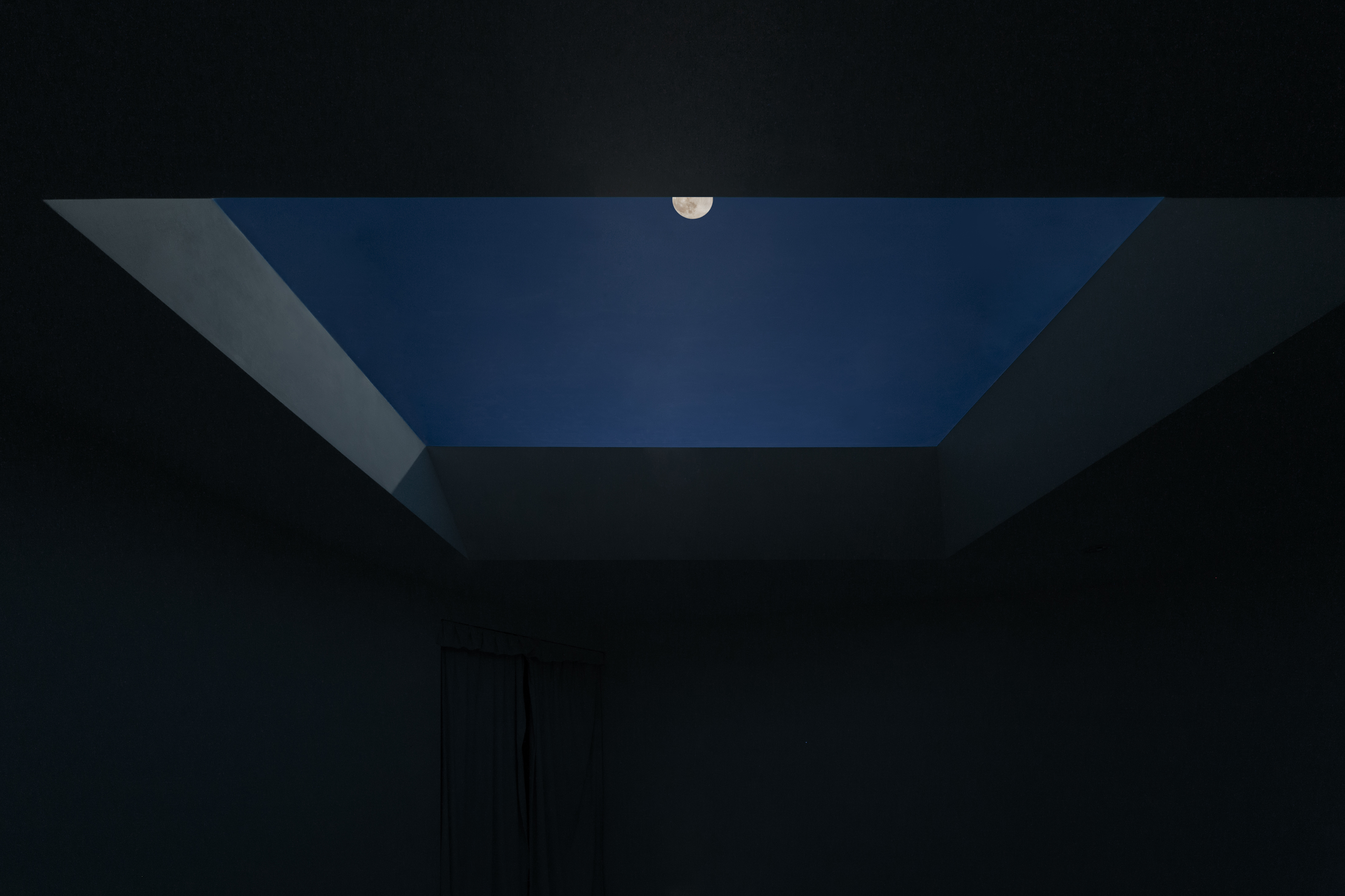
Blue for CoeLux
CoeLux reproduce the true effect of natural sunlight entering through the opening in the integrated ceiling, with a realistic sun perceived at infinite distance surrounded by a clear deep blue sky.
It’s the reproduction of the same mechanism experienced by sunlight as it travels through the Earth’s atmosphere. In this way, when light from the source impinges on the CoeLux panel, the short wavelength component (i.e. blue) is diffused and the long wavelength one (i.e. yellowish) is transmitted.
We play with blue.
The blue component of our light plays a complementary role to the yellow one, creating the perception of natural lighting.
In addition, our blue sky, works as a furnishing accessory within the spaces. The blue surface, wrapped by the frame, gives the perception of an infinite opening towards open spaces, giving people feelings of well-being, freedom, calm and happiness.
We bring pieces of blue into architecture and the world.
Sources:
https://www.pantone.com/color-intelligence/color-of-the-year/color-of-the-year-2020
https://www.architecturaldigest.com/story/pantone-color-of-the-year-2020
https://www.dezeen.com/2019/12/10/classic-blue-pantone-colour-of-the-year/
https://medium.com/studiotmd/the-perception-of-color-in-architecture-cf360676776c